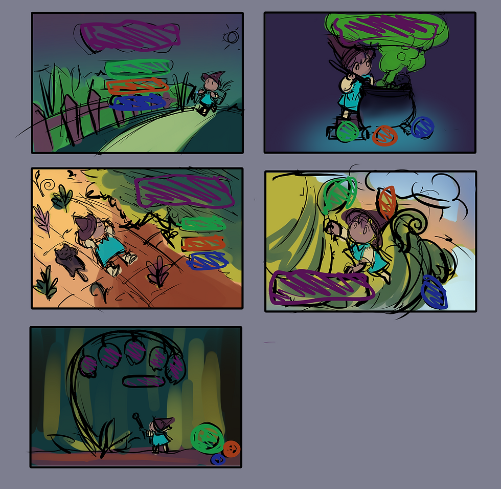
Dev Blog #6 [Dante] Conceptualization and Finalization
- Stosh Ferhobin
- Apr 20, 2022
- 3 min read
Updated: Apr 21, 2022

Hey, I’m Dante and I’m on the art team for The Witch’s Garden.
A lot of work I’ve done for the game is conceptual; upon approval by the rest of the team, I also play a hand in polishing these concepts and translating them into proper assets for the game. I was interested in building the world of this game through visual cues, as introducing a complex direct dialogue and cutscene system for narrative purposes was far beyond our scope.
One of the main ways the player is introduced to a world beyond the space they can access (which is limited to their yard and small exploratory enclosed spaces) is through the characters. A supernatural theme among NPCs was plausible considering the original pitch had already integrated a magical aspect into the game. From there, I was given a list of possible character descriptions from our narrative lead and tried to convey these ideas as visuals. Another thing I kept in mind when designing some of these characters was to keep them within the fun, cheerful atmosphere of the game–so that even the rougher and grittier characters wouldn’t come out too “scary”.

(First concepts for the Fairy, Cyclops, and Demon.)
Generally, I was also interested in using shape language as well as exaggerated proportions not only to keep the characters distinct from each other, but also to in some way, communicate their personalities in place of dialogue. I didn’t feel too restricted when following along with our established art pillars–especially when designing supernatural creatures, I didn’t feel like I had to conform to traditional body types.
Due to constraints, some of the characters from the original list were cut, and we decided against the necessity of having 3D character models for each NPC–instead, I drew new bust portraits for the remaining characters and made any changes to the character’s personalities visible with some minor design work.

(Final Portraits for Dahlia the Fairy and Glarus the Cyclops.)
Another thing I spent some time doing conceptual work for was the interior space of the witch’s house. The main factor I kept in mind with this design aside from the base values of the game was to keep it dark and mysterious, as the player would only be inside at nighttime. I also came up with more detailed versions of some objects, in order to make the concept of modeling them easier to grasp.

(Concept and floor plan for house interior.)
However, despite being the last thing I mention, one of the other large pieces of the game I also designed is also the first thing you see upon running it…the title screen! I played around with ways I could express the magical and whimsical feel of the game, something that would get the player excited to start, with accommodations for the placement of the title, and essential buttons to start and access settings.

What made me choose this particular design is that it provides the most accurate representation of the game; it focuses on a relaxed environment as well as the main mechanic, the farming portion. From there, it was just a simple illustration rendering task!
(Title screen idea thumbnails.)

(Final title screen.)
Thank you so much for reading, and thank you for following the development of this game! Be sure to check out the posts from other members of the team, if you haven’t already.

![Dev Blog #7 [David] - Wrapping Up Development](https://static.wixstatic.com/media/a45d53_58701c52a2ea44bab16b70e31f40623c~mv2.jpg/v1/fill/w_980,h_1292,al_c,q_85,usm_0.66_1.00_0.01,enc_avif,quality_auto/a45d53_58701c52a2ea44bab16b70e31f40623c~mv2.jpg)
![Dev Blog #5 [Ethan] - Designing the Player's Reference Book](https://static.wixstatic.com/media/a45d53_e0aff5fb5153417b9db4eae90b22025e~mv2.jpg/v1/fill/w_548,h_821,al_c,q_85,enc_avif,quality_auto/a45d53_e0aff5fb5153417b9db4eae90b22025e~mv2.jpg)
![Dev Blog #4 [Cal] - Character Design, Set Dressing, and UI](https://static.wixstatic.com/media/a45d53_21d9fc1a6b6843f397f2b4e9d191faaf~mv2.png/v1/fill/w_892,h_892,al_c,q_90,enc_avif,quality_auto/a45d53_21d9fc1a6b6843f397f2b4e9d191faaf~mv2.png)
Comments